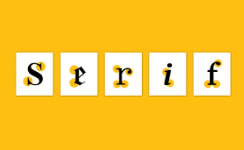
Serif fonts are considered more traditional and classic typefaces than their cousins, sans-serif. These fonts usually have little feet and things at the end of each letter. Some fonts are better for printing, and some are fine for screen display. This article will tell you all things about serif fonts.
What are serif fonts?
These typefaces have decorative strokes. These decorative strokes are known as serifs. In contrast, sans-serif typefaces do not. Georgia, Garamond, and Times New Roman are three common serif typefaces. These typefaces are Arial, Futura, and Helvetica are some examples. They are the ones with little feet at the end of each letter. They’re considered more traditional and classic than their cousins sans-serif without those pesky feet.
More traditional and classic typefaces
They are considered more traditional and classic than their cousin’s sans-serif. They have little lines at the end of each letter, known as serifs. They make a font more readable because they add visual interest to the words on your screen.
They are also legible, meaning that you can read them easier than sans-serif fonts because there aren’t any gaps or spaces between different letters when reading these seriffed typefaces, which is why we call them “legible.”
End strokes
You may have noticed that some letters, like the i and m in “wimpy,” don’t have serifs. That’s because serif fonts help guide readers’ eyes across a page.
Serifs are also called “feet” or “end strokes,” They’re found on many types of writing instruments, including pens and pencils, as well as on printed material like books and newspapers. These small markings are twofold. Firstly, they make sure letters are easier to read; secondly. They help establish distinctiveness between different characters within sentences by providing visual cues so that readers can quickly identify which letter belongs where in space when looking at the text.
Serif fonts for printing and screen display
Some Serif fonts are better for printing, and some are fine for screen display. The serifs give the letter shape a little extra uniqueness and help to make it stand out from other letters in your text. This can be especially useful in print, where you want people to read through multiple pages quickly without having to glance at each word before moving on to another part of the text.
Serif fonts, like Times New Roman and Georgia, are more traditional and suitable for print. They typically have long ascenders and descenders that give a slightly more formal look than sans-serif fonts like Helvetica. Serifs are also easier to read in print because they have consistent spacing between characters.
Serif fonts can be used for body text as well as headlines or headings on websites and other displays where there is lots of text, like newspapers.
Conclusion
This article has guided you about the serif fonts. You will learn about these fonts in the best way by reading this post carefully. Serif fonts are the way to go if you’re looking for a typeface to make your designs stand out. If you want to use them in print, choose one with high contrast between thick and thin lines to look even more impressive when printed on paper. Serif fonts are beautiful and versatile enough to be used in just about any kind of design project imaginable.